03 · Problem Definition
Defining the problem space
How Might We…
Redesign Robinhood's cash withdrawal flow so that a user can complete the task in under 30 seconds, with full visibility into their available balance and expected arrival time - without ever leaving the primary task flow?
Current Flow Map
From the home screen to a confirmed withdrawal, the current flow spans 5 screens and around 7 taps. The issue isn't the step count - it's the information that's missing or deferred at each step.
Home
tap 1
Menu → Transfers
taps 2–3
Amount entry ⚠️
tap 4
Review + confirm ⚠️
taps 5–6
Done
⚠️ = screen contains deferred or missing decision-relevant information
The 6 Pain Points
Walking through the current app flow reveals six distinct friction points, each of which either confuses users, forces them to backtrack, or withholds information they need to proceed confidently.
Current Robinhood Withdrawal Flow
Actual app flow screenshots (current)
These are the real captured screens for the current withdrawal flow.
Step 1: Home (Transfers not front-and-center)

Step 2: Menu (find “Transfers”)
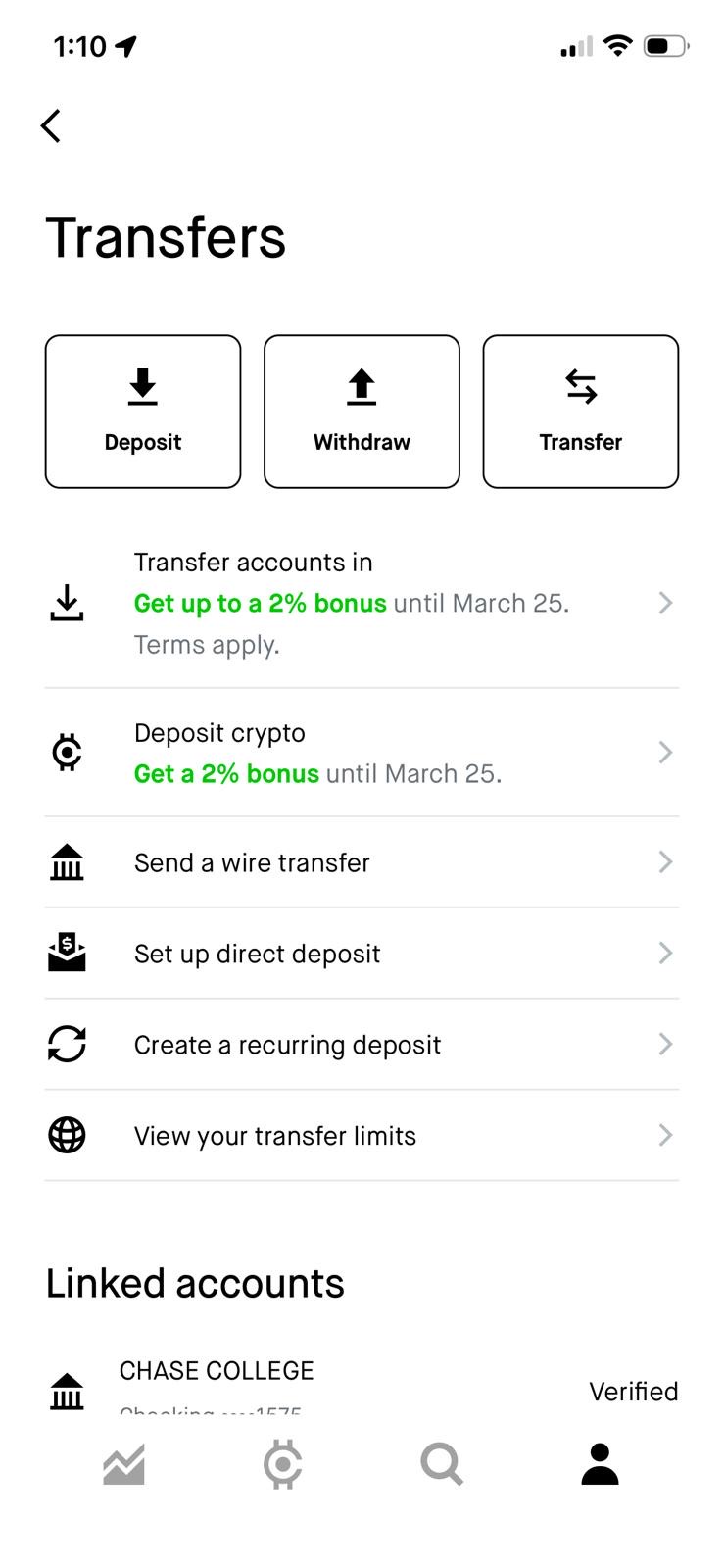
Step 3: Transfers (tap Withdraw)
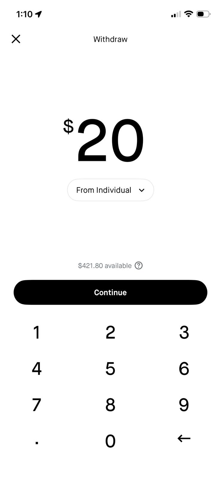
Step 4: Enter amount
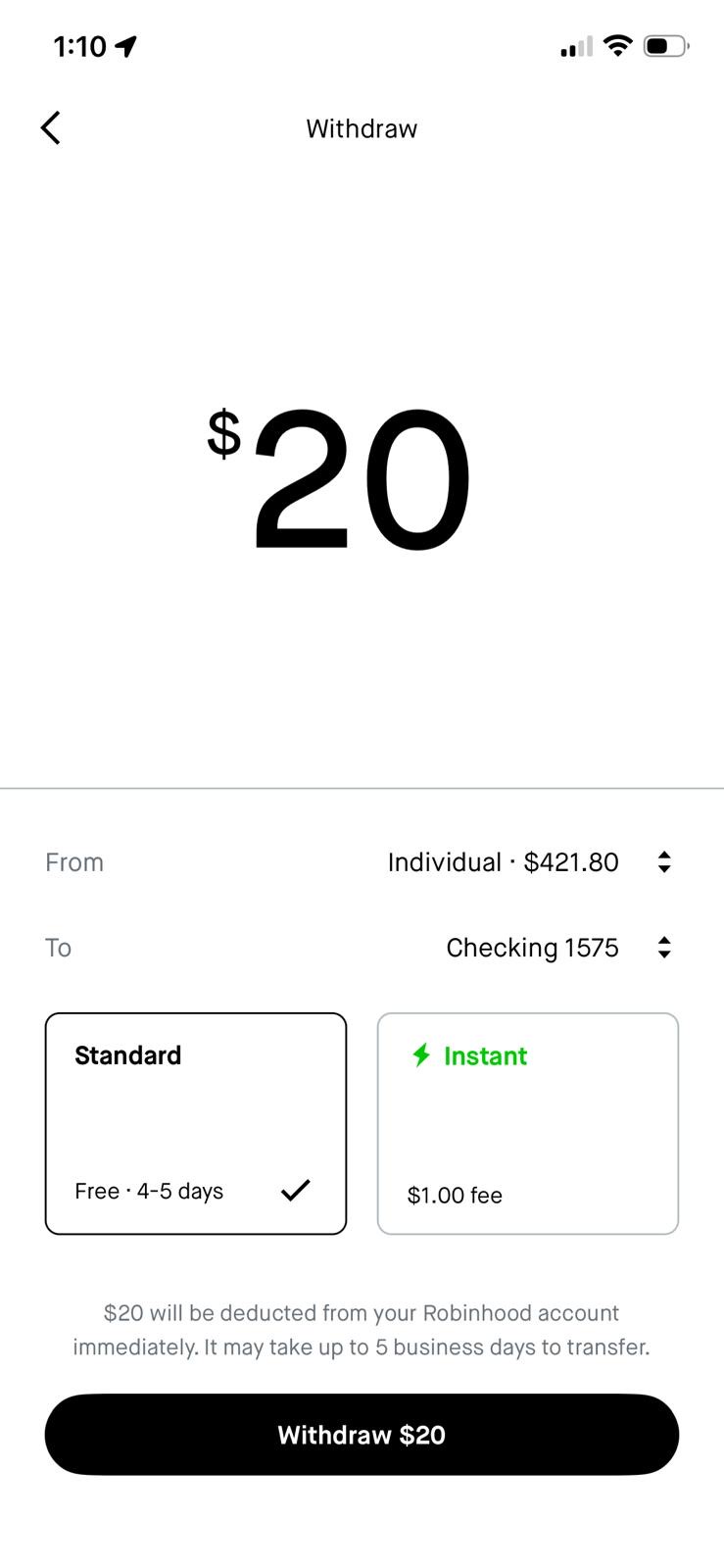
Step 5: Choose Standard vs Instant
1
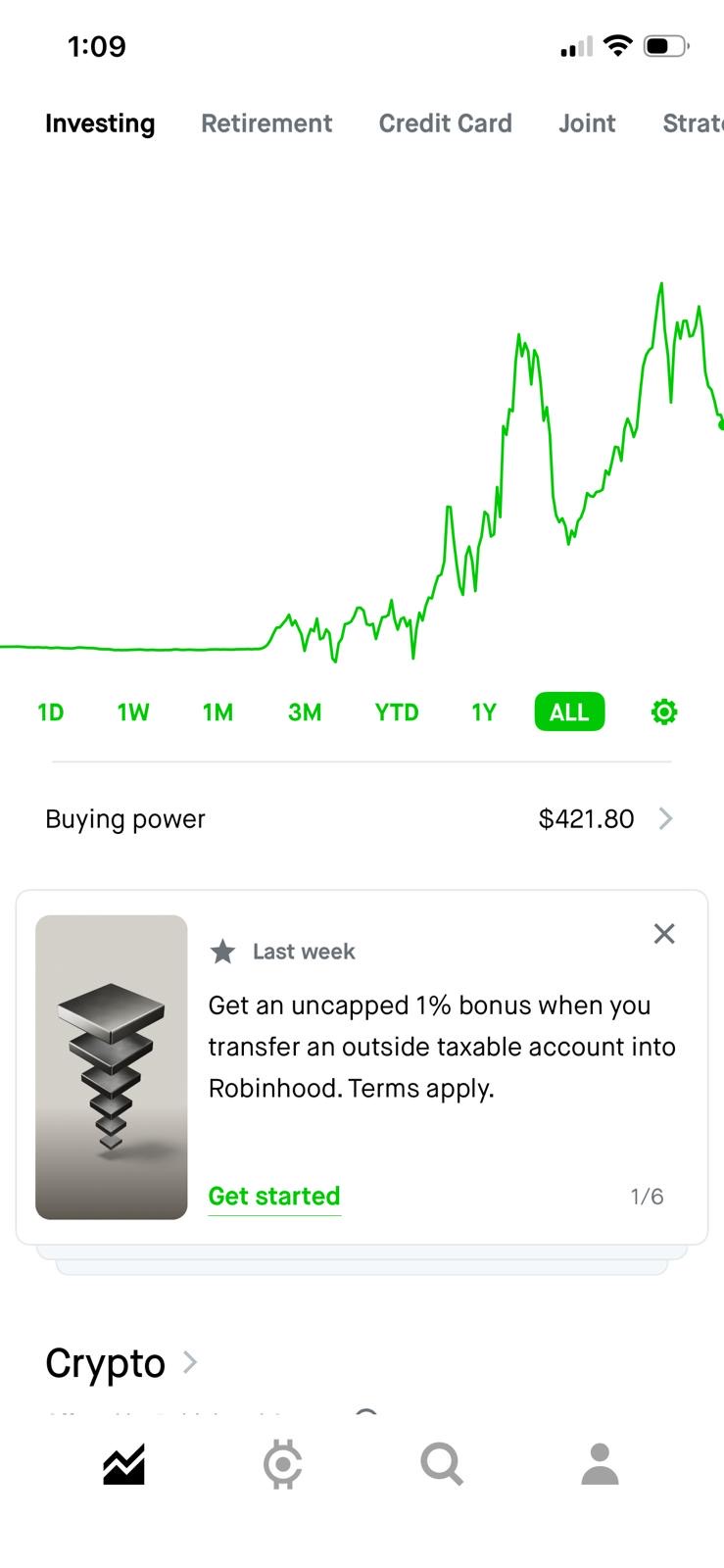
Withdraw buried behind Menu → Transfers. Withdrawing cash requires navigating to Menu → Transfers → Withdraw - three taps from the home screen with no shortcut. The home screen shows "Buying power $421.80" as a tappable row, but that leads to balance details, not withdrawal. Cash App surfaces "Cash Out" as the primary action on the home balance view.
2
Opaque account labeling: "From Individual" The amount entry screen labels the source account as "From Individual" - Robinhood's internal account type classification. Users unfamiliar with brokerage account types (Individual, Retirement, Joint) may not understand which funds they're drawing from or how to switch. A label like "Investing Account · $421.80" would be immediately clear.
3
No quick-amount options - manual keypad only The amount entry screen is a plain numeric keypad with no preset shortcuts. Cash App, Venmo, and Wise all surface common amounts as tappable chips ($25 / $50 / $100 / Max), reducing input friction for the most frequent withdrawal amounts. A Max chip would also eliminate any uncertainty about the withdrawal ceiling.
4
Speed choice appears too late in the flow The path to withdrawal goes through a “Transfers” step that isn't visible as a primary action in the user’s portfolio context. This causes extra searching and early back-outs. Bringing “Transfers” to the front reduces time-to-amount and makes the intent clearer immediately.
5
ETA revealed after commitment The transfer arrival date is only shown on the review screen - after the user has already worked through the intermediate navigation. This means users discover they chose "Standard" (3–5 days) when they needed "Instant" only when it's too late to change without starting over. This is a critical decision being made without the information needed to make it.
6
No exact arrival date shown in the flow Nowhere in the current withdrawal flow does the user see a specific arrival date. The review screen shows "up to 5 business days to transfer" as a disclaimer, but no calendar date. By contrast, Wise and Cash App both display an exact delivery date before the user confirms - giving users a concrete anchor for when their money will be available.